'Misty' and the Horrible Hidden History of British Comics (Part 1 of 3) by Julia Round
/British comics, especially those for girls, dominated children’s entertainment in the last century but have been all but forgotten today. When remembered, there is a perception that the boys’ titles were all about heroic adventures and space travel, while the girls got stories about horses and boarding schools. Nothing could be further from the truth! – these comics were not for the fainthearted and tales could often include murderous animals, football violence, Nazi soldiers, cursed choirs, deals with the devil, schoolgirl sacrifice, parallel worlds, monsters, possession, criminals and more..
Misty is an important part of this lost history. It was a weekly anthology comic for girls that told tales with supernatural or spooky themes. It was published by Fleetway and ran for 101 issues between February 1978 and January 1980. It appeared at the end of a decade in which British comics had started to dwindle due to competing entertainment media (cheap paperback books, television, early computer games), and publishers’ exploitation of their audience.

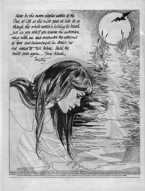
Cover, Misty #1. (1978)
Despite its short run, Misty is one of the best-remembered British comics. But its stories and themes were not unique. Spooky stories had featured prominently from the earliest days of British comics, such as ‘The Phantom Ballerina’ or ‘Jane and the Ghostly Hound’ in Amalgamated Press’s School Friend (1950-65). IPC’s great rivals DC Thomson had also made prominent use of the theme in comics such as Diana (1963-76), and particularly in their mystery title Spellbound (1976-78), which would be cancelled just as Misty was set to launch.
But a number of things made Misty stand out from the rest of the crowd. Firstly, its ethereal and seductive cover girl/editor: Misty herself, who welcomed readers to each issue, answered letters on the ‘Write to Misty’ letters page, and sometimes introduced stories in bookending panels (but only in the annuals and specials). Misty was the brainchild of the comic’s editorial team. Its sub editor, Bill Harrington, suggested that the comic should have a host type character: a spooky looking fellow called ‘Nathan somebody’. Nathan was rejected as too creepy, and Misty instead came to life: imagined by the comic’s first editor and co-creator, Wilf Prigmore. The team initially devised her as a ghostly looking character, but she quickly evolved into more of a spirit guide: a ‘child of the mists’ whose role is to present tales for our delight. Misty’s appearance was created by Shirley Bellwood, a portraitist and veteran of the older romance comics, and who based Misty closely on herself. With long black hair, flowing robes and a star charm, she resembles the new age witch of the 1960s and 1970s counterculture. Her welcomes to readers draw extensively on images of the body and the journey (see further below) as we are constantly urged to ‘walk’, ‘journey’, ‘quest’, ‘venture’, ‘step’ or ‘follow’ Misty elsewhere – crossing into another world.
Inside cover from Misty #16. Art by Shirley Bellwood, words by Malcolm Shaw, lettering and page design by Jack Cunningham.
Misty’s appeal is acknowledged by the comic’s first creator, writer Pat Mills, who says: ‘Misty worked well […] she is this beautiful witch-like character and I’m sure it would have had an appeal to a lot of readers and – being a little cynical about it – possibly the more middle-class kids, or middle-class mum would see it as “safe” whereas if they had seen the kind of covers I had in mind they might have said “Oh no, I don't want my Daisy reading this kind of nonsense!” Mills is credited with suggesting the initial idea for a girls’ horror comic as a vehicle for his lead serial, the Carrie adaptation ‘Moonchild’. He also had a key role in shaping the look of the comic, which drew on the innovations that he and art editor Doug Church had used in 2000AD. This included spreading stories over four pages rather than the usual three, allowing for one big panel or splash page to introduce each instalment.

‘Winner Loses All!’, Misty #79. Art by Mario Capaldi, writer unknown.
Misty’s dynamic page layouts are the second reason for its impact – as part of my research into this comic I instigated a small-scale research project (funded by Bournemouth University’s Centre for the Study of Journalism, Culture and Communication) into these layouts. This was devised and conducted by Dr Paul Fisher Davies, who tagged layout features in ten randomised issues, Tags included panel features such as angled borders, round borders, open borders, jagged borders, and so forth, along with page layout features such as arrows, colour, inset panels, and splash pages. The pages were also categorized in terms of their relationship to a standard ‘grid’ or number of tiers.
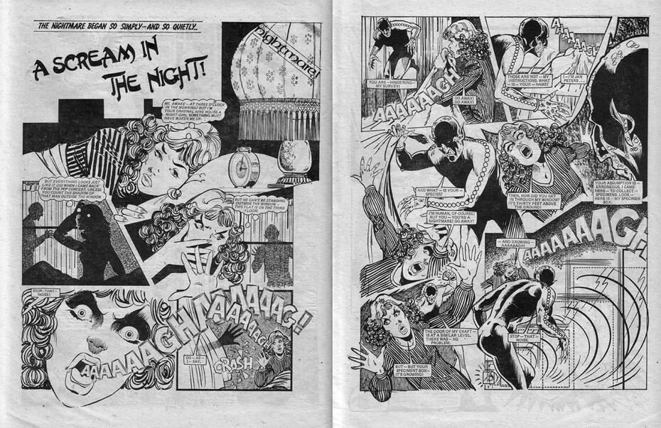
‘A Scream in the Night’, Misty #47. Art by Jorge Badia Romero, writer unknown.
The findings were remarkable. Misty’s pages are continually transgressive and dynamic – in the sample of 241 pages there were no pages that received no tags – even those that appear simple and perpendicular still have at least one dynamic feature, such as an open panel border or staggered tier. Panel borders are varied and experimental in form: they are often angled, liminal or indeterminate (ragged, misty) or broken in some way. The most common feature found was the borderless panel, achieved either by using blank space to create an implied border, or by overlaying consecutive images so they appear contiguous. Another significant page feature noted was transgression, where character limbs or other objects break an enclosing panel border or other spatial container, which occurs on ninety-three pages (39%). These exciting formats are most often used for a purely decorative purpose with no clear narrative meaning, although in some instances they are modalising (i.e. have ties to the story content, such as a cloud shape to indicate a dream or memory). When modalising features appear, they tend towards the emotional and symbolic rather than the prosaic – for example indicating heightened emotion (jagged border) or reinforcing the central motifs of the story (representational border).
The study’s findings also helped us reflect on the usefulness of current comics theory, using the notion of the ‘tier’, which is an important organizational principle of the comics page and is prominent in francophone discussion of bande dessinée (as ‘bandes’ or ‘strips’ are integral to the French name for the medium). The work of Benoît Peeters (1991), Thierry Groensteen (2009, 2012), and Renaud Chavanne (2010) supports the search for tiered patterns as a principle in the Misty layouts. However, this project found that while tiers do seem to be an organizing principle for most Misty pages, this seldom takes the form of a straightforward grid. Variations such as staggering (where the upper and lower edges of panels in sequence do not line up) and tilting (where the baseline that defines reading progression is at an angle rather than horizontal) are extremely common: appearing on ninety-six pages (40%) and eighty-nine pages (37%) respectively.
The dramatic and dynamic page design also has much to do with Misty’s art editorial team: art editor Jack Cunningham and art assistant Ted Andrews, who both worked on the comic for its entire run. The art was commissioned from Spain, drawing on artists from three main studios (Selecciones Ilustradas, Creaciones Editoriales/Bruguera, and Art Bardon), and sometimes manipulated heavily to fit house style. Cunningham recalls that when it was received it would be in various sizes, so the first thing to do was to ‘make a standard size that every artist worked to, and it used to appear as quite simply as square frame, square frame, square frame, and as we got a better idea we perhaps started off with some figures that were outside of the frame, run the titles across two pages, and break it all up, bit by bit […] I didn’t go through the whole script of course, but I designed what the opening page should look like and the end page should look like. And then here and there indicate where it would be better to leave a frame open perhaps. Because it’s very static, and very difficult to get any feeling of movement.’ Some artists also designed their own page layouts, with the extra page allowed for each story giving them space to shine.
The Spanish artists who worked on Misty and many of the other British girls’ and boys’ comics of the time were powerhouses of talent, and their skill is the third reason that Misty had such an impact. These artists had defined the look of 1950s British romance comics, dominating Fleetway’s catalogue of titles (such as Valentine, Mirabelle, Roxy and Marilyn), and glamorising their content. While it has often been assumed that the Spanish artists were used because they were cheap, artist and researcher David Roach (Masters of Spanish Comic Book Art) states categorically that ‘They weren’t used because they were cheap, they were used because they were the best!’ Many worked for the American industry at the same time. Isidre Mones remembers Misty fondly, saying ‘I always had a suspicion that there is a sector of British women between forty and forty-five years old traumatized by those comics that I drew. I overlapped them with my Warren work, and I did not disguise the terrifying aspect very much!’
Stories were not signed and original art was not returned, so the identification of artists is an ongoing task conducted by fans and scholars online. For those interested in learning more, a searchable database of all the Misty artists’ names and story summaries is available at www.juliaround.com/misty. Recycling and ‘bodging’ was used extensively to get the most out of an expensive piece of quality art. While almost all of the content of the weekly issues was original, the annuals and specials would reprint these stories, alongside reprints from earlier titles. The accepted wisdom was that stories could be recycled every few years as the audience would have moved on, although this was not always the case.
Misty’s fourth great strength was in its highly skilled writing team and its combination of different story types. As creators were not credited it is hard to identify the authors of stories, although its editorial team (editor Malcolm Shaw, and sub editor Bill Harrington) would have written many of these. Malcolm Shaw and Pat Mills had worked together previously, launching Jinty in 1974, before it was taken over by Mavis Miller when she left June. Shaw took over from Misty’s initial editor Wilf Prigmore after just a few issues, and served for almost the comic’s entire run. Although Malcolm Shaw wrote for many girls’ titles, the Misty stories were a perfect fit for his interests in science fiction and myth, and allowed him to push the boundaries of fiction for girls. He was passionate about the title and was its lead editor for the bulk of its run.

Julia Round’s research examines the intersections of Gothic, comics and children’s literature. Her books include Gothic for Girls: Misty and British Comics (2019), Gothic in Comics and Graphic Novels: A Critical Approach (2014), and the co-edited collection Real Lives Celebrity Stories. She is a Principal Lecturer at Bournemouth University, co-editor of Studies in Comics journal (Intellect) and the book series Encapsulations (University of Nebraska Press), and co-organiser of the annual International Graphic Novel and Comics Conference (IGNCC). Her new book on Gothic for Girls and Misty is accompanied by a searchable database, creator interviews, and other open access notes and resources, available at www.juliaround.com.