Man Without Fear: David Mack, Daredevil, and the Bounds of Difference (Part Three)
/Last time, I explored some of the ways that David Mack's visual style defines itself outside of the mainstream conventions of superhero comics. Today, I want to start with a recognition that Mack is not the only experimental comic artist who has sought to engage with the superhero genre. In so far as it defines the expectations of what a comic book is, at least in the American comic book, artists often seek to define themselves and their work through contrast with the superhero genre.

Daniel Clowes' The Death Ray is a thorough deconstruction of the superhero myth, depicted through multiple genres, though most often read in relation to our stereotypes about serial killers and school shooters. Note here Clowes' self conscious use of primary colors -- red and yellow -- to set up the lurid quality of the more fantastical sequences in the book, often standing in contrast with the more muted colors of realistically rendered scenes.
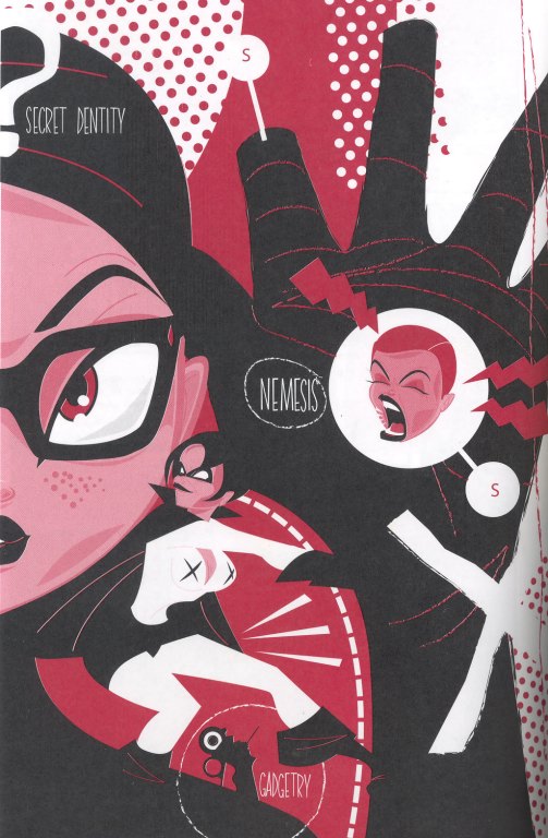
Project Superior is a recent anthology of superhero comics drawn by some of the rising stars in the independent comic worlds, resulting in work which further defamiliarizes the conventions of the genre.
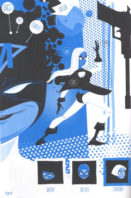
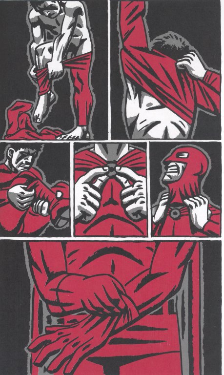
I particularly admire a series of red, yellow, and blue images created by Ragnar which reduce the superhero saga to its basic building blocks. There is no story here, only the elements which get repeated across stories. This Doug Frasser story is clearly intended to suggest Daredevil though not in ways that would illicit a legal response from Marvel.
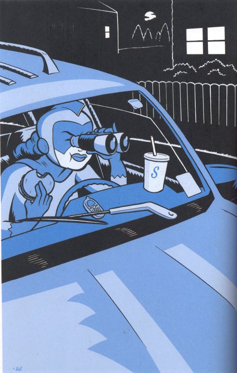
This one by Rob Ullman which combines a play with iconic elements and a much more mundane sense what kinds of work superheroes perform.
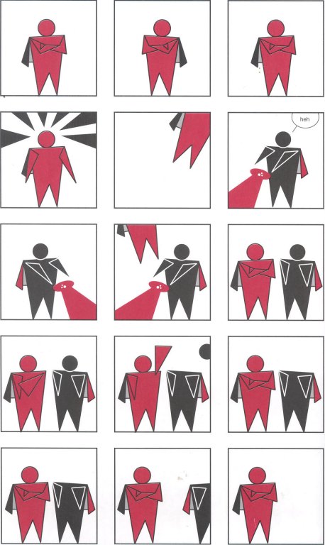
Here, Chris Pitzer further abstracts the characters into a series of geometrical shapes with capes, while following the basic narrative formulas to the letter.
These experiments are interesting because they explore the potentials for abstraction or realism which exist on the margins of the mainstream industry. There is also a great pleasure in watching these gifted cartoonists use the codes of mainstream companies as resources for their own expressive play.
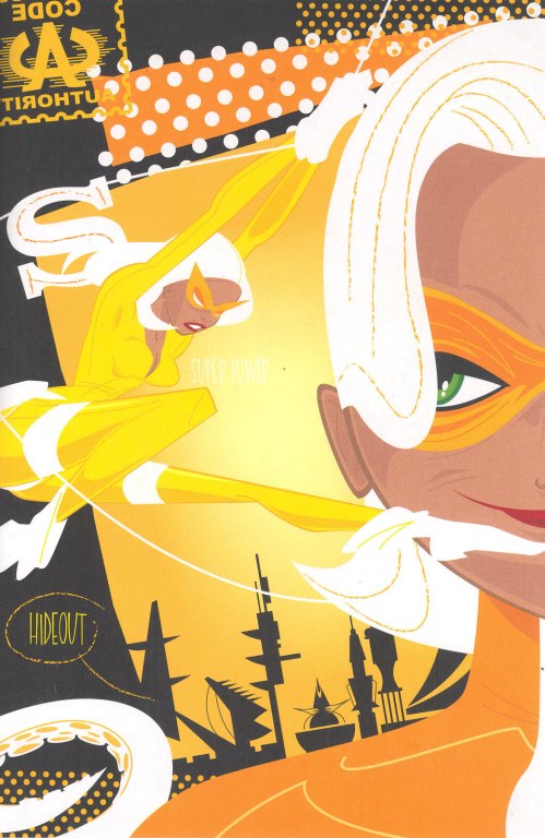
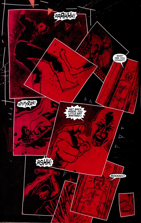
We can see similar forms of abstraction in Mack's work in the Daredevil franchise. So, for example, this page from Wake Up is as fascinated with the color red as anything found in Project Superior.
And we see throughout Vision Quest Mack's fascination with reading the central characters through various forms of abstraction, often involving pastiches of the work of particular modernist artists.
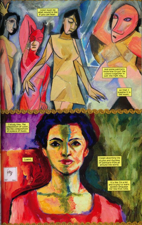
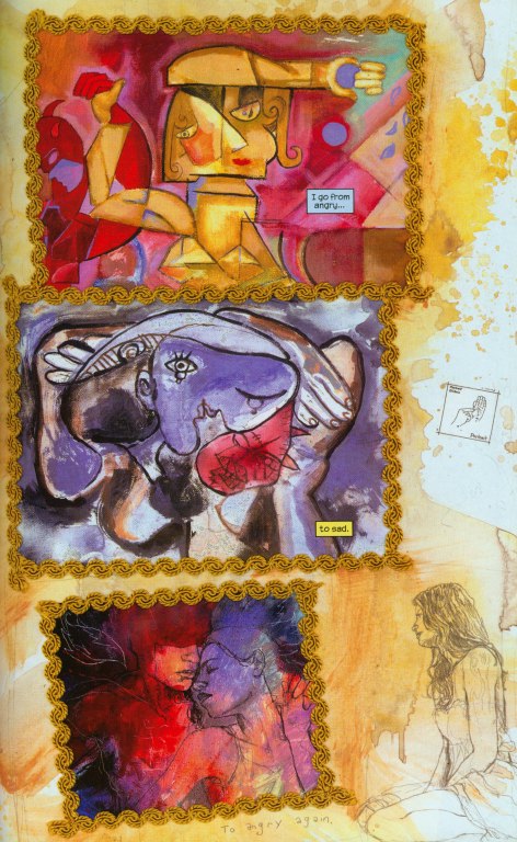
This play with abstraction can be understood as part of the process by which Echo wrestles with her own identity, especially given the many overlays of other's performance she has absorbed through the years as she has exploited her powers on Kingpen's behalf.
Or consider the various ways that Mack deconstructs Wolverine, one of the more iconic characters in the Marvel universe and thus one which will remain recognizable even in a highly abstracted form.
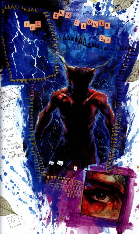
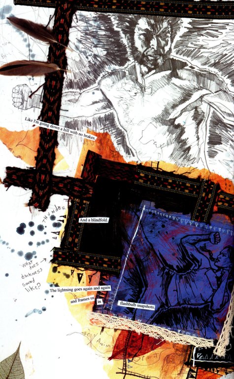
Mack is interested especially in three aspects of Wolverine's persona -- his animal like ferocity, his claws, and his metal-enhanced skeleton -- which become, in the end, all that remain of the character in some of these images. Wolverine becomes a set of claws without a man much as the Cheshire Cat becomes a grin without a cat.
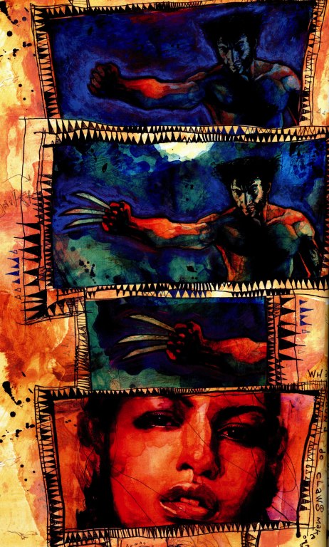
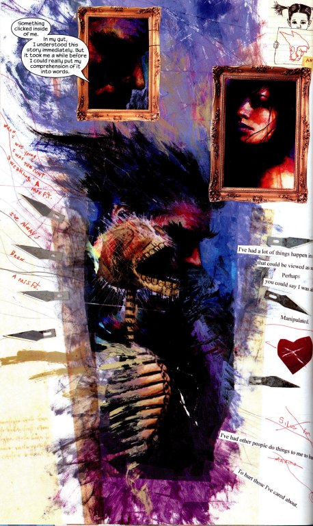
Note how Mack uses the frame lines to pick up the shape and impact of the claws or how he incorporates photorealistic renderings of animal bones to remind us of the skeletal structure which gives the character his strength and endurance. By this final panel, Mack uses Exacto blades to suggest Wolverine's claws and shows us only the human bones beneath his skin. Here, the abstraction serves the purpose of creating ambiguity since as we read this story it is not meant to be clear whether Echo met the actual superhero or whether this Wolverine is a projection of her shamanistic vision.
Mack's collaboration with Brian Bendis seems to rely heavily on his capacity for abstraction. For Wake Up, Mack is asked to depict the world of the superhero as seen through the eyes of an emotionally disturbed child who has watched his father -- the Frog -- die at the hands of Daredevil and who has struggled to process what he saw.
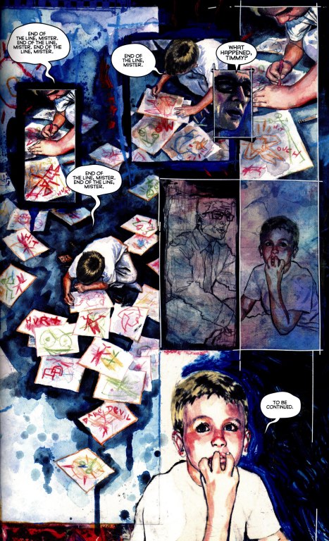
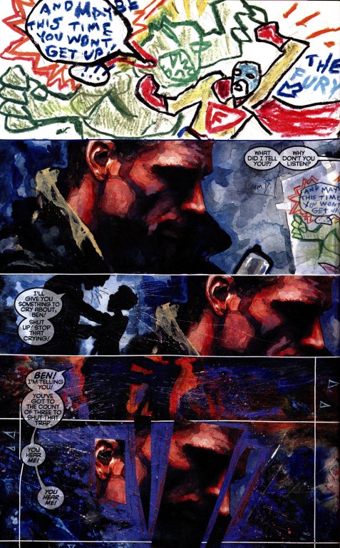
Here, Mack's movements between highly realistic and more abstracted images are meant to convey objective and subjective perspectives on the action. The child endlessly draws images of superhero battles and as the story progresses, we learn how to sequence those images to match the voices he hears in his head. Needless to say, there are clear parallels to be drawn to the movement from single images to sequences of images which constitutes the art of comic book design. As with Vison-Quest, the story refocuses on a secondary character -- Ben Urich -- with Daredevil seen only in terms of his impact on their lives. We can see the focus on the subjective experience of an emotionally disturbed character as a historic way that modernist style gets rationalized in more mainstream projects -- starting perhaps with the ways The Cabinet of Dr. Caligari frames German expressionism in terms of the world as seen through the eyes of a patient in an insaine asylum or for that matter, how Hitchcock absorbed aspects of Salvador Dali's surrealism into Spellbound, another film set at a mental hospital.
The Final Part Comes on Friday.